
- Marketing & Advertising
Disruptive Branding – Gap customers weren’t just buying hoodies, but actively shaping the brand
Gap customers weren’t just buying hoodies, but actively shaping the brand
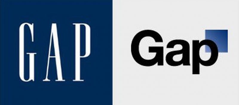
In 2010, the US clothing chain GAP tried to change its logo. For decades, the logo had been white lettering on a blue square, with a classic feel. In 2010, the business tried to offer a more snappy, modern looking logo. But consumers mourned the loss of the old version. Then the following happened …
Source: Disruptive Branding: How to Win in Times of Change (Book)
- Case Studies
- Flops & Failures
- Re-Branding

 Loading...